Founder notes
What two launches taught us about building a product businesses can actually use
We're trying to bring ease of use and flexibility into the same product, and the more we build, the more closely the engineering and UX decisions depend on each other.

Co-Founder & CTO, Noodle Seed
· Noodle Seed and Store of Scope
We've launched Noodle Seed on Product Hunt twice this year, and I've been thinking about what those two launches taught us about the product we're building now. When I put them on this diagram, the trade-off becomes quite easy to see. Our first product made it easy for someone to get started within the experience we'd designed for them. The second gave engineers much more freedom to build the experience they wanted. Now we're trying to bring those qualities together, which sounds straightforward until you start working through what that actually requires.
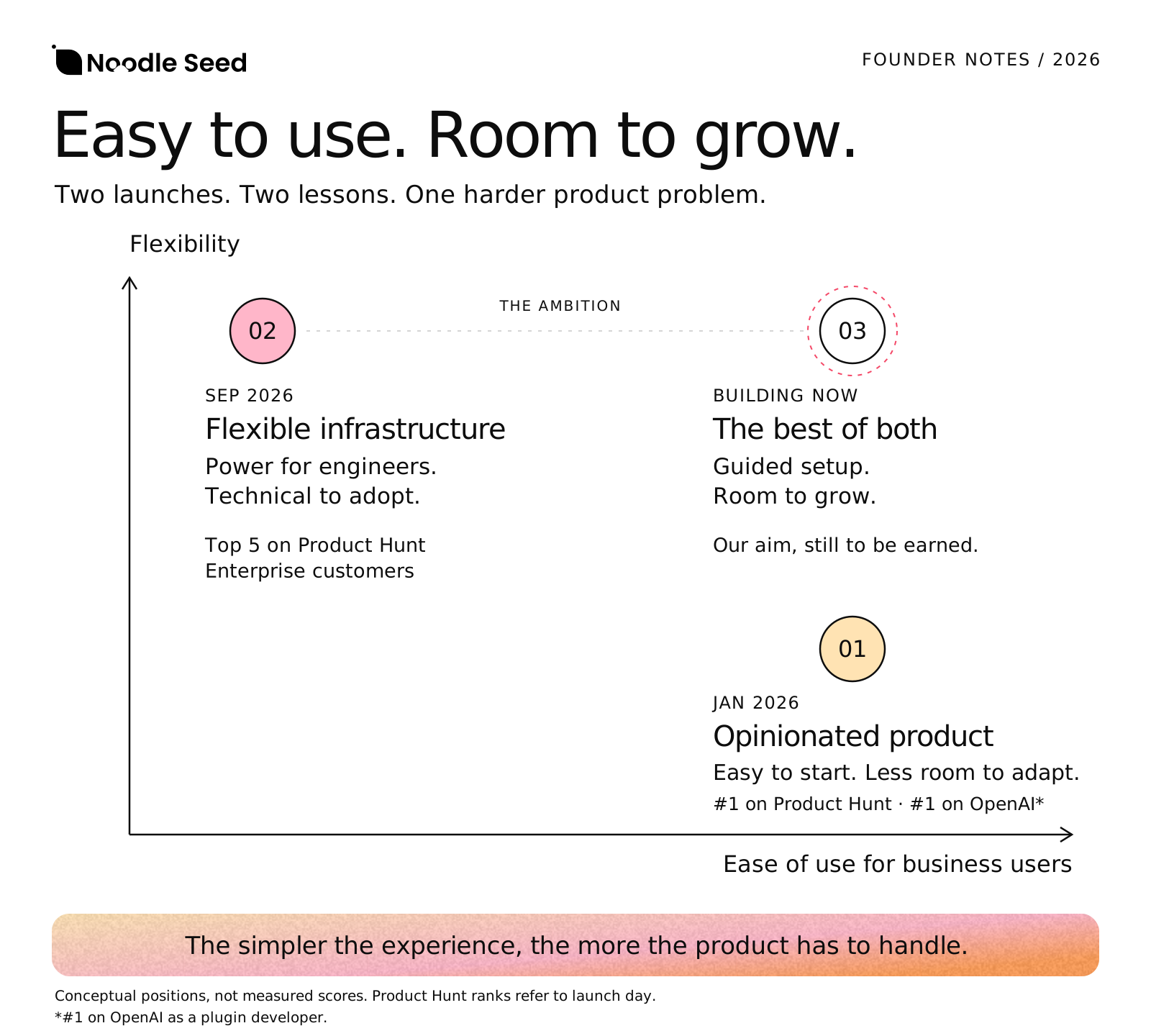
When we launched in January 2026, we reached #1 of the day on Product Hunt and ranked #1 on OpenAI as a plugin developer. The product was highly opinionated, and that was a large part of why it was approachable. We'd made a lot of decisions upfront about how things should work, so a user didn't have to figure all of that out before getting somewhere useful. But as we thought about serving a more horizontal set of businesses, those same decisions started to limit us. A restaurant, a travel business and an e-commerce store might all want to help their customers through conversation, but they need different information, different actions and different rules. We hadn't left enough room for that variety.
With the September launch, we went much deeper into the infrastructure. Engineers could build on our cloud infrastructure and shape things around their own requirements, which gave them considerably more flexibility. We finished #4 of the day on Product Hunt and brought in enterprise customers, but there was still a problem for the business users we wanted to reach. They could understand what was possible and still have a technical project ahead of them before they could use it. A company without engineers would struggle, and a company with engineers could have exactly the same problem if the team was already committed to other work. That dependency was limiting the velocity at which we wanted to grow.
I think this is a part of the conversation around AI products that deserves more attention. “You can vibe code it” can help someone get further with an implementation, but you can't vibe code away the need to understand what a business is asking the software to do. Someone still has to decide which account it can access, which actions it can take, what the customer needs to approve and how to recover when an external system behaves unexpectedly. Code generation helps with building, while responsibility for those decisions still sits with someone. For the business owner, that's a lot to take on before they can offer something useful to a customer.
The new product we're building is our attempt to combine the ease of that first experience with the flexibility of the infrastructure underneath it. What makes it challenging is deciding where the product should take responsibility and where the user needs meaningful control. If we make too many assumptions, we recreate the limitations of January. If we expose every option, we bring back the technical burden of September. We need a starting point that makes sense to a business owner and enough depth for the product to keep being useful as their requirements change.
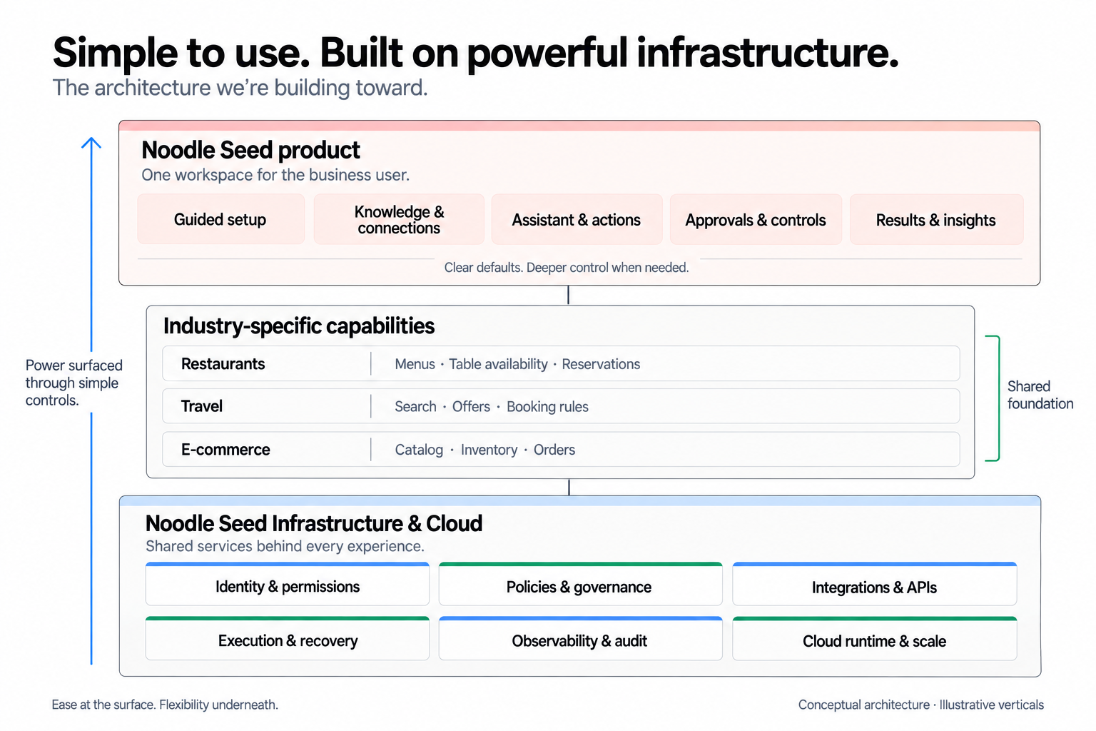
This is where the UX rules become very practical. Matching the system to the user's world means starting with something they understand, such as helping a customer find a stay or request a table. That choice should lead them towards the information and account access needed for that particular task. Underneath, though, we have to know which operations are supported, which permissions are available and what is still missing. The words on the screen can be simple because the product has done the work of connecting them to a specific, supported action. That's how we're applying the familiar usability principles of understandable language, consistency and visible system status described in Nielsen Norman Group's heuristics.
Progressive disclosure is another useful principle here, because someone shouldn't need to work through every advanced setting before trying the product. We can give them a sensible starting point and introduce deeper controls when those controls become relevant. But from an engineering perspective, the guided experience and the advanced controls have to work with the same underlying configuration. Otherwise, you end up with an easy path that becomes difficult to change, or an advanced edit that breaks assumptions made during setup. The defaults need to be editable, the changes need to be validated and the user needs a way to test what they've changed before it affects customers.
Serving different industries makes that balance more demanding. There are parts of the experience that should feel familiar everywhere: choosing an option, reviewing the details, confirming an action and checking the result. But a restaurant reservation still has a party size and service time, a hotel offer has occupancy and cancellation terms, and a product has variants and stock. We need to preserve those differences while sharing the parts of the interface that people can learn once and use again. These are examples of the range we're designing for, and each needs its own supported implementation before we can offer it as a working capability.
One example that brings the engineering and UX problems together is a booking provider timing out just after a customer has confirmed. The booking might have gone through even though we didn't receive the response. If we immediately tell the customer to try again, we could create a duplicate. If we show a confirmation, we could be promising something we haven't verified. The system needs to keep a reference to the attempted action and check what happened, while the interface needs to preserve the customer's details and explain why confirmation is still pending. That's quite a lot of responsibility behind a few words on a screen, and it has to work when the customer is already worried about whether they've just made a booking.
The same thinking applies before an action happens. A customer needs to see the details they're agreeing to, and their confirmation should apply to those exact details. If a price or selection changes, the system has to recognise that the earlier approval no longer covers the new proposal. That requires checks underneath the interface as well as clear communication within it. Recovery needs the same attention: keeping valid input, explaining what completed, showing what remains unresolved and offering a next step the system can actually support. Even a stop button needs an honest account of whether further work stopped and whether something had already happened externally.
And all of this has to remain usable in the conditions people actually work in. Someone might be setting things up on their phone, coming back after an interruption or dealing with an expired connection. Important terms need to remain readable, actions need to be reachable, keyboard navigation needs to work and status needs to make sense without relying on colour or animation. Those requirements affect how we build the components and preserve state from the beginning. They also force us to think beyond the first successful interaction and consider whether someone can still make progress when the circumstances are less convenient.
For me, this is what makes the next product so challenging and so interesting to build. Every choice we simplify for the user creates work we need to handle more carefully ourselves. We'll need to see whether a business owner can get to a useful starting point, adapt it to another use case and understand what happened when something doesn't go as expected. Those are questions we intend to test across the kinds of businesses we want to serve. The dot at the top right of the diagram represents that ambition; it isn't a measured result or a claim that we've already solved it.
We want Noodle Seed to help businesses grow conversationally, with an assistant that helps their customers choose, book and buy. The two launches have given us a much clearer understanding of what's involved in making that accessible. We know why the first product was easy to start with, and we know what the infrastructure makes possible. The work now is in bringing those qualities together in a way that a business owner can understand, use and keep growing with.